
We asked AI to design new Portsmouth home, away and third kits for next season - here's what it produced
We asked AI tool, Grok, to design a new kit for Pompey next season, and here’s what it came up with...
The current season might have 11 games still to play, but that doesn’t mean planning ahead of the 2025-26 season isn’t already under way.

Behind the scenes at Fratton Park, there’ll be a mryiad of people working tirelessly to ensure everything is in order and ready to click into place for when John Mousinho & Co return from a well-deserved summer break.
From transfer targets to season tickets, from pre-season fixtures to essential Fratton Park and training ground upgrades, the process of making sure everything runs like a well-oiled machine will have already started.
The process of deciding what kit Pompey will sport next term will have also begun, with manufacturers Nike well aware that the Fratton faithful take a huge interest in the designs that emerge ahead of each new term. It’s not always possible to please everyone, so the pressure will once again be on the creators to come up with a concept that gets approval from the majority.
How that process works exactly, we’ll probably never know. But does it really need to be a drawn-out affair? Does it take days, weeks or even months of pain-staking decision making to come up with the right design? In this new age of AI technology, perhaps not!
As an experiment, we asked X’s AI tool, Grok, to come up with three credible kits - home, away and a third - that Pompey could potentially wear next term.
The aim was to create something plausible and design rooted in the club’s identity - and here’s what was produced, along with a detailed explantion of the chosen designs.
Note: None of the kits designed by Grok should be mistaken as match-day strips Pompey will wear next season.
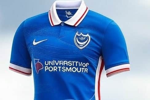
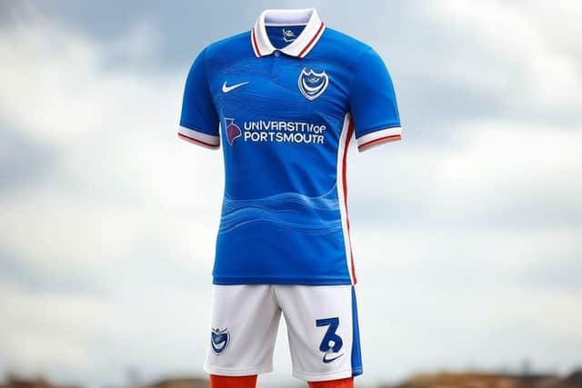
Pompey home kit - and what Grok had to say
Inspiration
The design celebrates Portsmouth’s identity as a port city with strong naval roots, blending heritage with a modern twist. The wave pattern symbolizes the sea’s constant motion, while the red, white, and blue palette honors the club’s storied past.
Base colour
The kit retains the classic royal blue as the primary colour, a nod to Portsmouth’s traditional identity and its naval heritage.
Design Elements
Wave pattern: A subtle, embossed wave graphic flows diagonally across the chest, inspired by Portsmouth’s maritime history and the Solent waters. The waves transition from a darker blue at the bottom to a lighter shade near the shoulders, creating a dynamic yet understated effect.
Collar: A modern polo-style collar in white with thin red trim, blending tradition with a fresh look. The collar features a small embossed anchor on the inside, a hidden detail for fans.
Accents: Red and white accents appear on the sleeve cuffs and side panels, reflecting the club’s iconic color scheme. The cuffs include a faint geometric pattern inspired by the Spinnaker Tower’s silhouette.
Sponsor and logo: The Nike logo and Portsmouth FC crest sit in white on the chest, with the Universirty of Portsmouth sponsorship logo in a contrasting red to pop against the blue.
Material: A lightweight, breathable fabric with Nike’s latest technology, featuring micro-textured waves for both style and ventilation.
Pompey away kit - and what Grok had to say

Philosophy
The away kit is designed to be a practical, versatile counterpart to the home kit, leaning on the club’s traditional white away color while weaving in local and historical elements (waves, naval anchors, Spinnaker Tower). It balances simplicity with personality, ensuring it stands out on the pitch while feeling like a natural extension of Portsmouth FC’s identity. The white base offers a fresh canvas, with blue and red accents providing familiarity and energy.
Primarily White Base
White is a classic choice for away kits, providing contrast to the royal blue home kit and ensuring visibility against darker opponent colors. It also ties into Portsmouth’s traditional color scheme (blue, white, and red), maintaining a sense of continuity while offering a cleaner, lighter aesthetic often favored for away designs.
Subtle Embossed Wave Graphic in Light Blue
The wave pattern, carried over from the home kit, keeps the maritime theme alive, reflecting Portsmouth’s identity as a port city. Using light blue for the waves on a white base creates a subtle, elegant effect - distinct from the home kit’s bolder transition - while symbolizing the sea’s calmer, reflective side. It’s a nod to the Solent waters without overpowering the design.
Royal Blue Polo Collar with White Trim
The royal blue collar brings in the club’s primary color, ensuring the kit feels unmistakably Pompey. The white trim softens the contrast and ties into the base color, while the small embossed anchor inside the collar (mirroring the home kit) adds a hidden detail that fans can appreciate - a subtle link to the naval heritage.
Red Accents on Sleeve Cuffs and Side Panels
Red is a key part of Portsmouth’s traditional palette, so including it on the cuffs and side panels adds vibrancy and balance. It connects the away kit to the club’s history and the home kit’s accents, keeping the design cohesive. The red also stands out sharply against the white, giving the kit a crisp, dynamic edge.
Geometric Pattern Inspired by Spinnaker Tower on Cuffs
This detail echoes the home kit’s cuffs, reinforcing a unified theme across the set. The Spinnaker Tower is a modern symbol of Portsmouth, and its geometric shape translates into a stylish, understated pattern that adds personality without cluttering the clean white base.
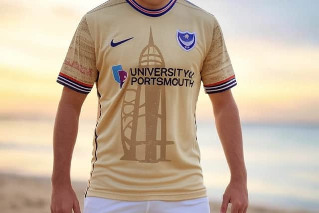
Pompey third kit - and what Grok had to say
Philosophy
Third kits often allow for more creativity, so I aimed to blend local symbolism (beaches, Spinnaker Tower, naval heritage) with a stylish, modern aesthetic.
The sandy beige palette feels fresh yet rooted in place, while the nautical details and club colors ensure it’s unmistakably Portsmouth FC. It’s meant to be a kit that fans could wear proudly as a statement piece, reflecting both the city’s character and the team’s legacy.
Sandy beige base Colour: I chose sandy beige to reflect the beaches of Portsmouth, like Southsea Beach, grounding the kit in the city’s coastal geography.
It’s a bold shift from the usual blue, white, or red, making it stand out as a third kit while still feeling relevant to the area’s natural landscape.
Spinnaker Tower silhouette
The darker beige silhouette of the Spinnaker Tower across the chest is a tribute to one of Portsmouth’s most iconic landmarks.
It’s a modern symbol of the city’s regeneration and pride, giving the kit a unique visual anchor (pun intended) that resonates with fans and ties into the geometric cuff pattern from the home kit.
Nautical striped collar
The red, white, and blue stripes on the collar nod to the club’s traditional colors and Portsmouth’s naval history. This keeps the design cohesive with the home and away kits’ maritime theme, but the striped pattern adds a playful, sailor-inspired twist fitting for a third kit’s experimental vibe.
Subtle anchor pattern on cuffs
Anchors are a recurring motif in Portsmouth’s identity due to its port status. Including them subtly on the cuffs maintains continuity with the home and away kits (where an anchor appears inside the collar), while keeping the design uncluttered and sophisticated.