
Fans react to new Pompey kit
Pompey today unveiled their new home kit for the 2017-18 season.
And it appears the fresh design has gone down well among Blues fans, who helped chose it by taking part in a poll last autumn.
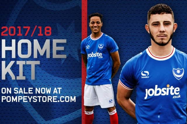

Here’s what they have been saying on our Facebook page Portsmouth FC – The News and on portsmouth.co.uk...
A bit retro... a bit different. A potential promotion classic on our hands?
Colin Johnson
First since the KJC one that I’ve really liked. Sensing a pattern - pardon the pun.
Ant Coombes
1968 all over again.
Mick Griffin
It looks fine. I had hoped for the Option B (with two halves in different shades of blue) just because it would be a bit different to last year’s.
But there is nothing wrong with this kit.
First round-necked top we’ve had for a few seasons.
Lazer Face
It Reminds me of a shirt we wore many yeara ago.
Anyone old enough to remember George Ley and Mike Trebilcock may remember the shirt too!
To be honest, IMO it’s not a fantastic design but if we win promotion wearing it, it will be long remembered and loved!
WJD
I like it! It’s the traditional look, and reminds me of our kit from years ago, and personally, to me, it looks like a Pompey kit should look.
No gimmicks, no fussy, flashy trimmings, just a ‘proper’ English football kit.
Our lads in this kit will look like footballers, not models for male beachwear.
I might even get one myself!
m hill
I like it, good traditional design.
One point, Michael Eisner spoke quite openly about the need to alter (slightly) the crest for copyright purposes etc.
I wander how long a process it is should he decide to make a change?
Medway Blue
Love it! Traditional look and happy it’s very much like my own nostalgia shirt except my crest is (unfortunately) yellow.
northstandeasy
Not a big fan personally, Looks very similar to Oldhams’ kit.
PFC1023
Quite like that.
Owen Vanderhoven